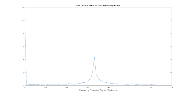
As before I hooked a nice polarised antenna up to the lab VNA and moved a pipe around in front of it, while looking at the power reflected into the VNA from the antenna (and calibrating out the power literally reflected by the antenna itself to try and isolate the reflections due to the pipe). Of course being 4th year engineering means that all of this is automated after the initial setup!
I had a few predictions about this second set of tests:
- Our lovely dominating sinusoid (the one with the increasing and decreasing reflectivity) would increase in (spatial) frequency to match our increase in RF frequency.
- The sample would induce a greater reflection as its size (in RF wavelengths) was now bigger.
- The tail end of the previous reflectivity graph started to look flatter, I was expecting this flat region to develop earlier on in the graph
Of these only 1. turned out to be true, the increase in size relative to wavelength of the sample appears to have been swamped by greater path loss, the radiation losing energy as it travels, which is greater at higher frequencies. Additionally the flat area did not appear, making me suspicious that its manifestation in the earlier graph was an artifact of me 'under-sampling' the distance/reflectivity waveform.
My pipes at this point were about a wavelength wide (as opposed to the half-wavelength width they have for 5 GHz waves) which has another important part of the test as my trusty textbook had illustrated that the reflectivity properties change around this point (and a bit lower). This appears to have been observed, certainly the PVC pipe appears to now be reflecting more power when it is horizontal, earlier it was reflecting marginally more when it was vertical. The metal pipe appears to be reflecting equal amounts of power independent of its orientation - which is interesting and requires further investigation...
Anyway, the results graphs:
 |
| Reflectivity Graph, now pointier... |
 |
| FFT plot, also pointier |
No comments:
Post a Comment